
Developers, researchers, and product managers all wonder: What's the latest design? Where can I find it? What's the flow? Do you have a prototype? What was the objective? Which persona?
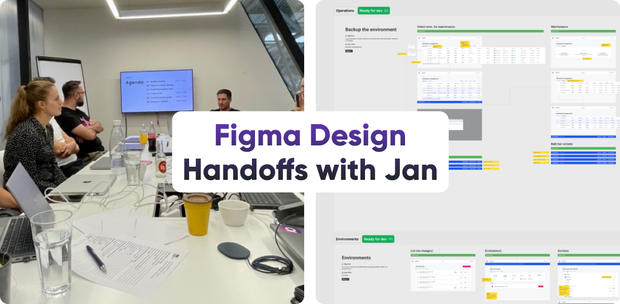
That's right. It’s time to talk about design handoffs.
In this article, we're going to share how we identified issues regarding the design handoff and processes across all our product teams in Ataccama, and how we tried to solve them — respecting that every designer and their product team is unique.
Background
During 2021/22 the company grew by more than 200%, having around 300 people in Product. The design team grew from 5 designers to 14, adding UX researchers and a UX writer. At the same time, we also switched from the Scrum methodology to our internal SpaceUp model to keep pace with the company’s growth. Our designers are now split into different product teams, each consisting of product managers and developers.
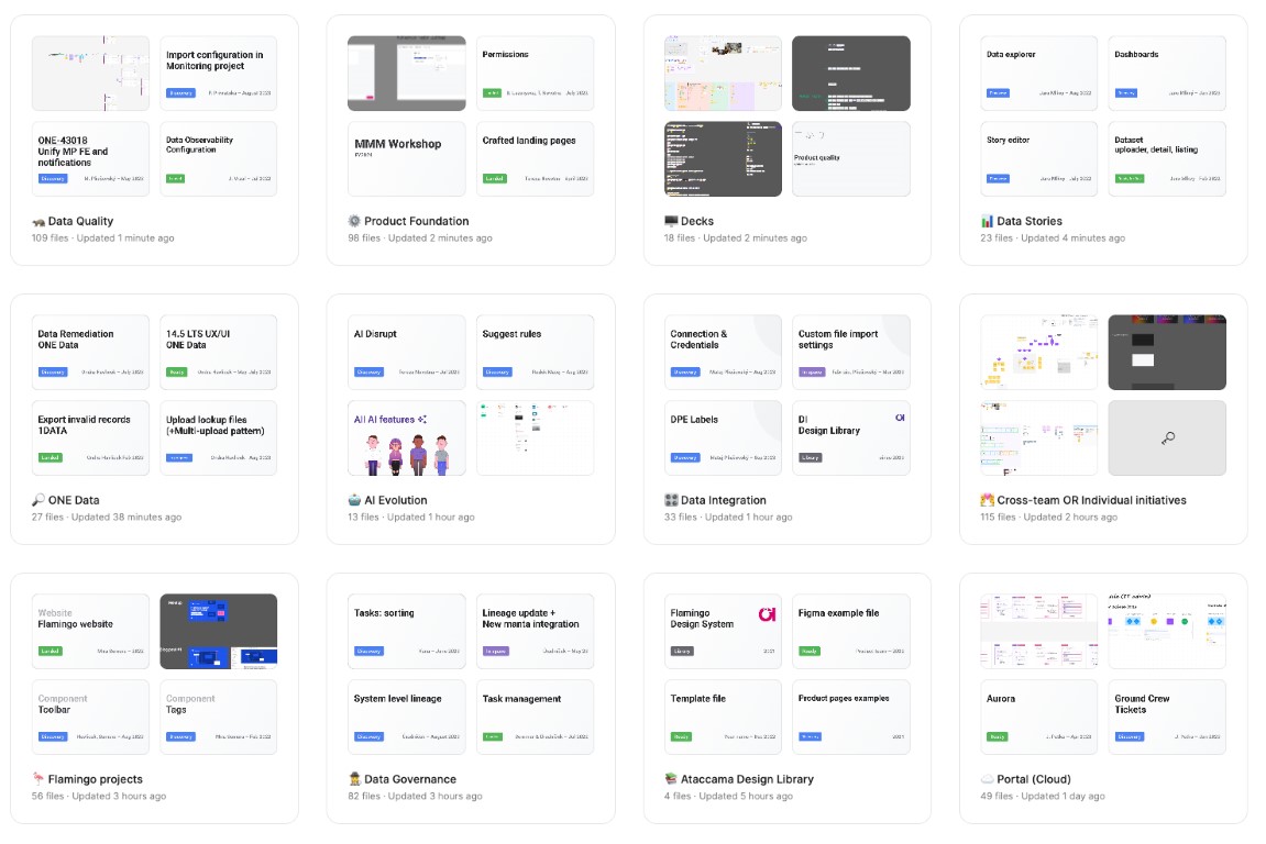
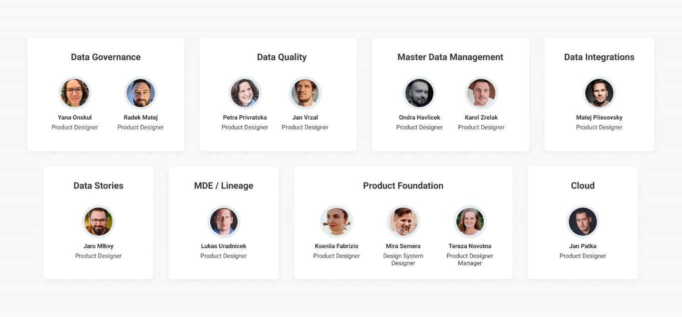 Designers under Spaceports
The Challenge
We were hearing more and more often that people were getting lost in our design files. The classic evergreen was that the front-end developers couldn’t find the final design. Product managers wanted to see the work in progress. Even us designers, researchers, and writers were struggling while searching or reviewing the files of other designers.
The design files’ organization and structure were inconsistent across all spaceports, mostly because each designer had their own way and it wasn't a priority for us at first. The lack of structure within the files made collaboration challenging, and potentially led to mistakes such as "What’s the most up-to-date version?", "What’s an exploration?”, “What can I start developing?" or “What should I give feedback on?”
Our goal was to improve the searchability, legibility, and usability of design files, and therefore speed up the workflow. We aimed to have all Figma files consistent by following the same conventions to ensure consistency.
At the same time, we knew that every spaceport and every designer is unique, and we wanted to avoid being too strict. We were worried that designers wouldn't follow the guidelines if it was like that.
How we identified the problem — The workshop
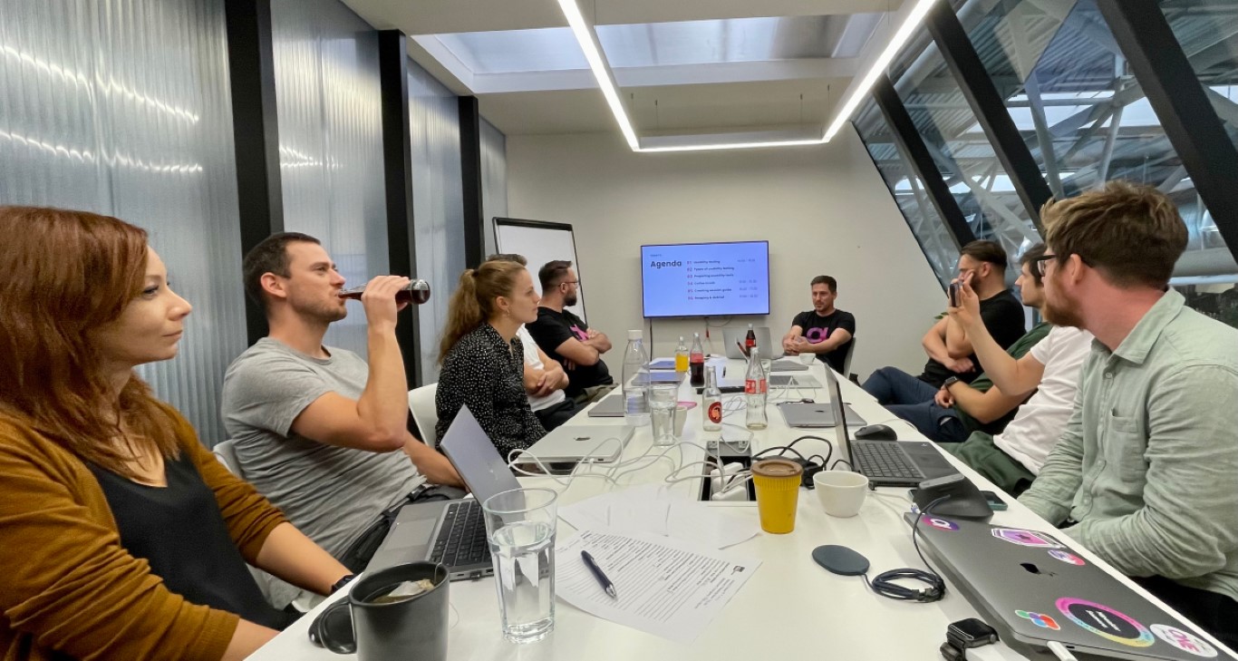
All of us got together at our Brno office 🥳 and divided ourselves into four groups. Each of us reviewed someone else's file and identified the biggest pain points. We then grouped all the findings together and sorted them by relevance.
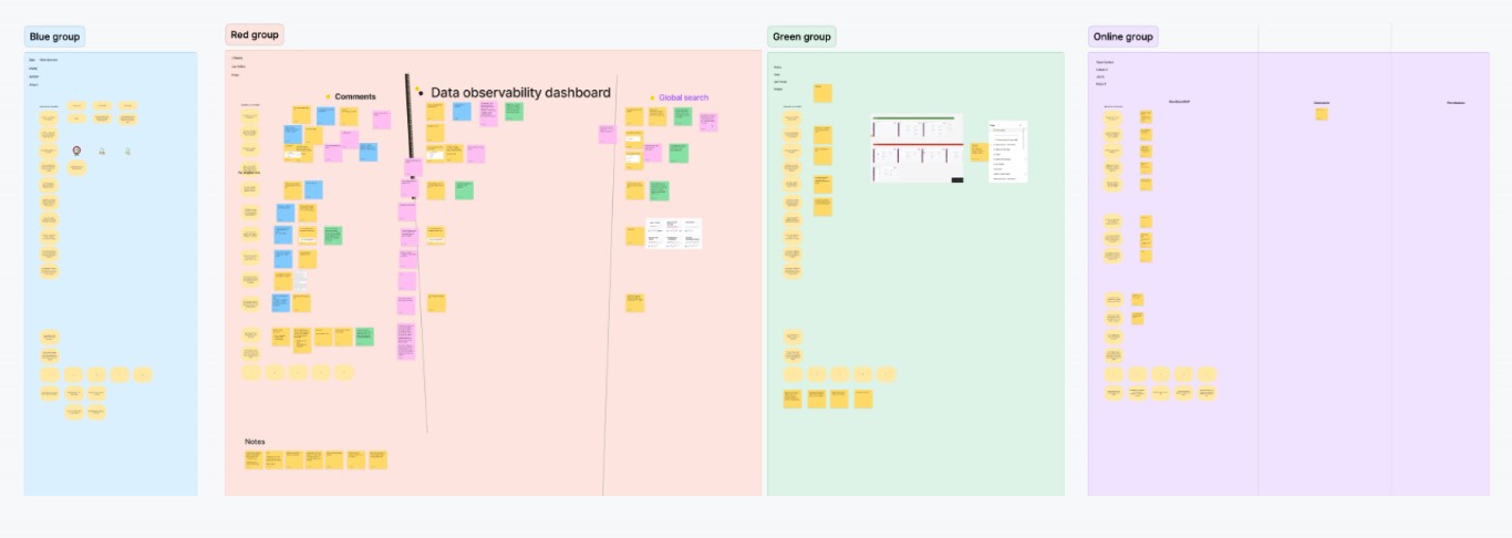 Each group had time to came up with their pain points
The main findings are:
- Audience: Each stakeholder (PM, FE, etc…) uses our files differently.
- Figma structure: What’s better? One file, or several independent files?
- File structure: It’s hard to navigate within a Figma file, especially when comparing old versions against new ones and finding the final version.
- Annotations: Annotations are missing or not unified.
- Figma cover: It is not always clear who is working on the file, and important information such as the date (is it new or old?) and the state are missing.
- Searching: Finding the right file can be challenging.
- Naming: Frame names are inconsistent or missing altogether.
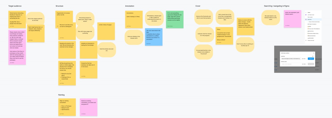
Issues grouped by topic
The workshop provided a great opportunity to uncover hidden issues, share our struggles, and bond as a team. With the outputs from the workshop, we could better formulate questions to ask our teammates during internal research and in deeper one-on-one conversations.
Let’s test our assumptions — with internal research
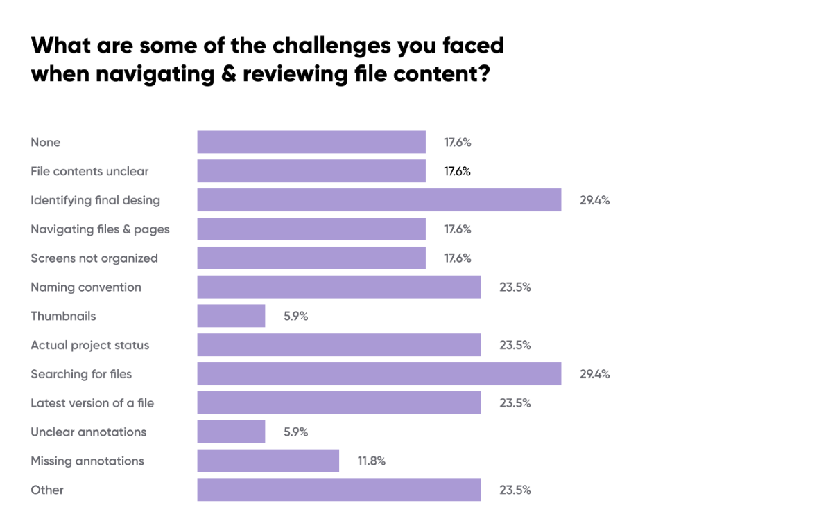
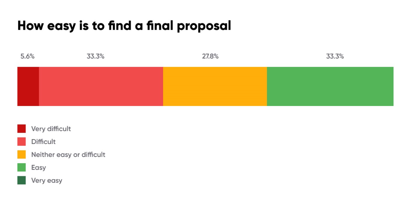
We needed to identify our audience, how they used our files, and what their biggest challenges were. We conducted a survey across our teams, and the results are here.
Navigating in Figma
The main reasons for accessing Figma are mostly related to viewing product development screens, product flows, use cases, and prototypes for UX testing. This holds true for both product managers and front-end developers.
Here are some quotes from users regarding their experiences with navigating Figma:
- "I never needed to navigate in Figma. I always access a specific page using a link provided by someone else."
- "Until recently, I had no idea that I should be a part of the Ataccama team to see a new navigation." (meaning to see a list of all files in the project)
- "I was only working with files shared with me, which was quite a pain, and I had no idea that a more convenient way even exists."
Many users have said that there is often too much information housed in a very large area in Figma. One design file may contain too many individual screens, making it harder to navigate and find exactly what you’re looking for.
- "Variants of a particular visual element may be more useful than plenty of screens scattered over a large area."
- "Smaller Figma pages/files with cross-links could be helpful. It's sometimes a pain to find a particular screen."
- "Pages can be humongous. Splitting them into smaller chunks would make work more comfortable."
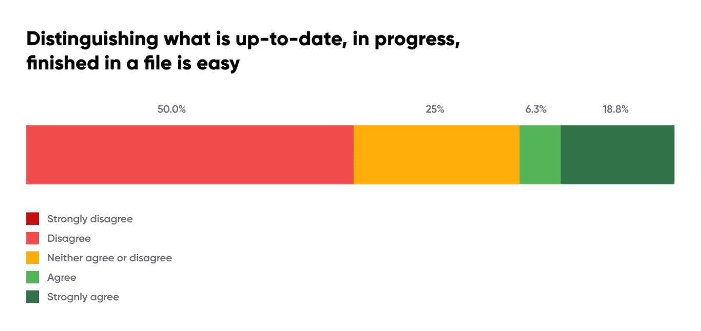
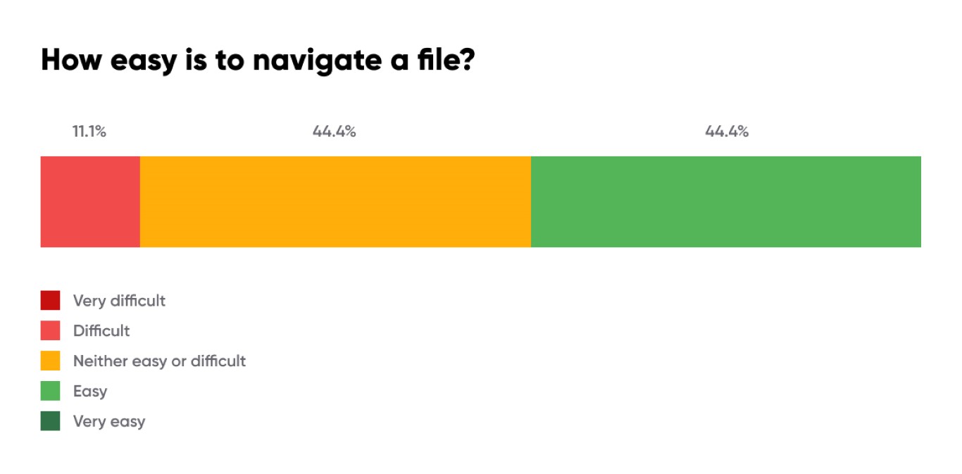
Identifying what is up to date, in progress, finished, or archived is currently not working for users.
- “If proposals are properly denoted as "ready for development" and have a fitting name, it's easy to navigate in the pages list.”
- “Having Ready for Dev screens just on one page.”
- “Distinguish between user flows and states of the components.”
- “If there are some new components or patterns in the design, those should be ideally included as components with all states so devs don't have to search for it across the flow”
- “Somehow mark pages (proposals) that need a decision”
- “A naming convention of frames, so I can easily find what I’m looking for in Figma”
- “Remove unused designs”
- “I can't find old designs unless I have a link to them - I would like all designs related to my part of the product to be in a common folder, and I would like to be able to search for a specific design”.
Annotations
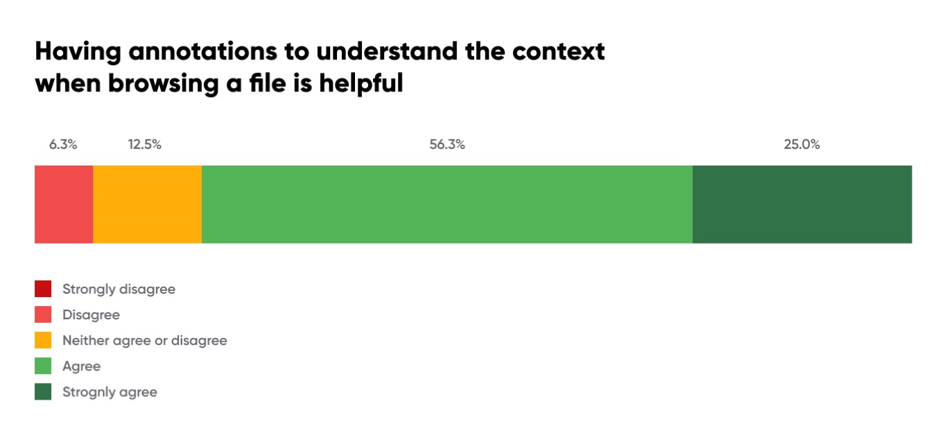
- “Questions and answers in small windows are all super useful! Thanks a lot."
- “I probably wouldn't be afraid to add more comments and annotations to the design files."
Solution
Completing such a large task alone is difficult. It's crucial to have an owner who will drive the project forward. We divided the work among four designers, with each working on a specific improvement while being overseen by an owner who was responsible for the topic. Each proposal was reviewed first internally, and then with the entire design team. Typically, we received 1-2 rounds of feedback before we started to use it across our company. Afterward, we received another round of feedback from other stakeholders. At that point, we felt confident to make final changes and let the project flourish on its own.
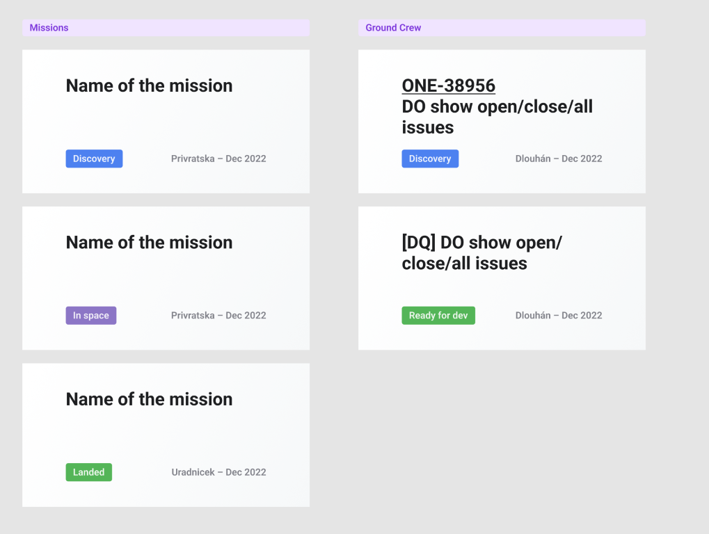
1. Team structure
We are currently using the Figma Professional plan with one team and multiple projects divided by "spaceports". This organizational structure has worked fine from the beginning. The only issue is that developers and managers couldn't see this view until they were part of the team. Therefore, one of the tasks was to make sure this information will be shared during onboarding.
2. File covers
Old covers
Old covers grid
The old covers had several issues:
- States did not follow the same terminology as the mission we are flying.
- Research, discovery, and ready for development were usually blended together.
- People forgot to mark them as done.
- While the description was helpful, it added unnecessary visual noise to the list of all files.
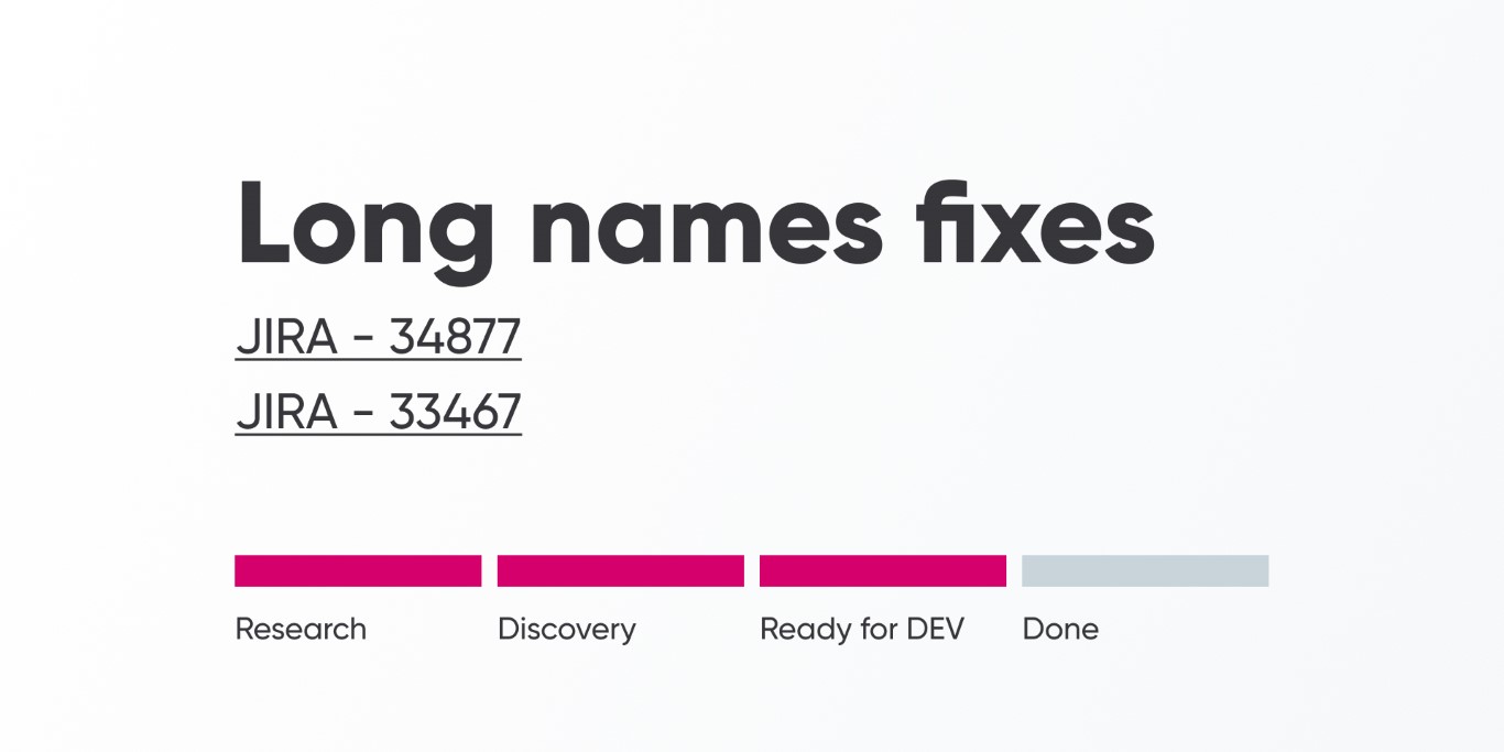
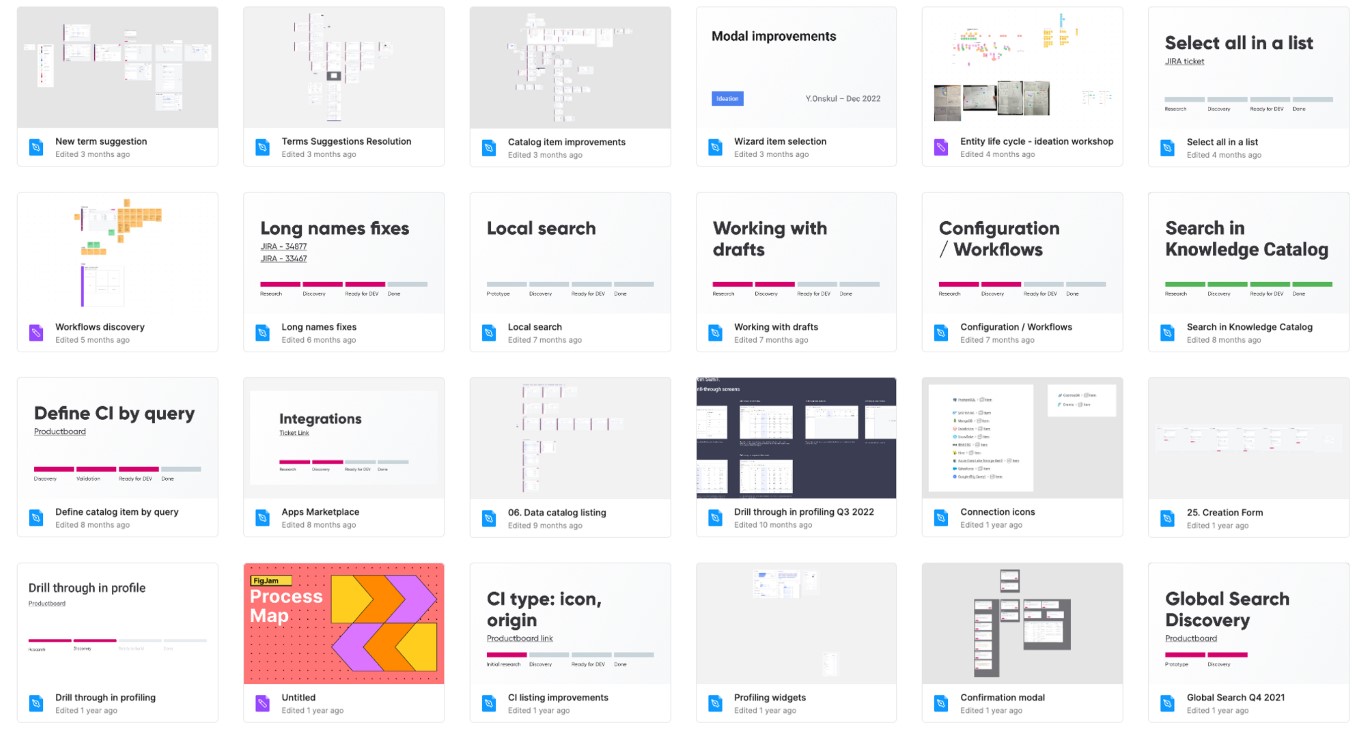
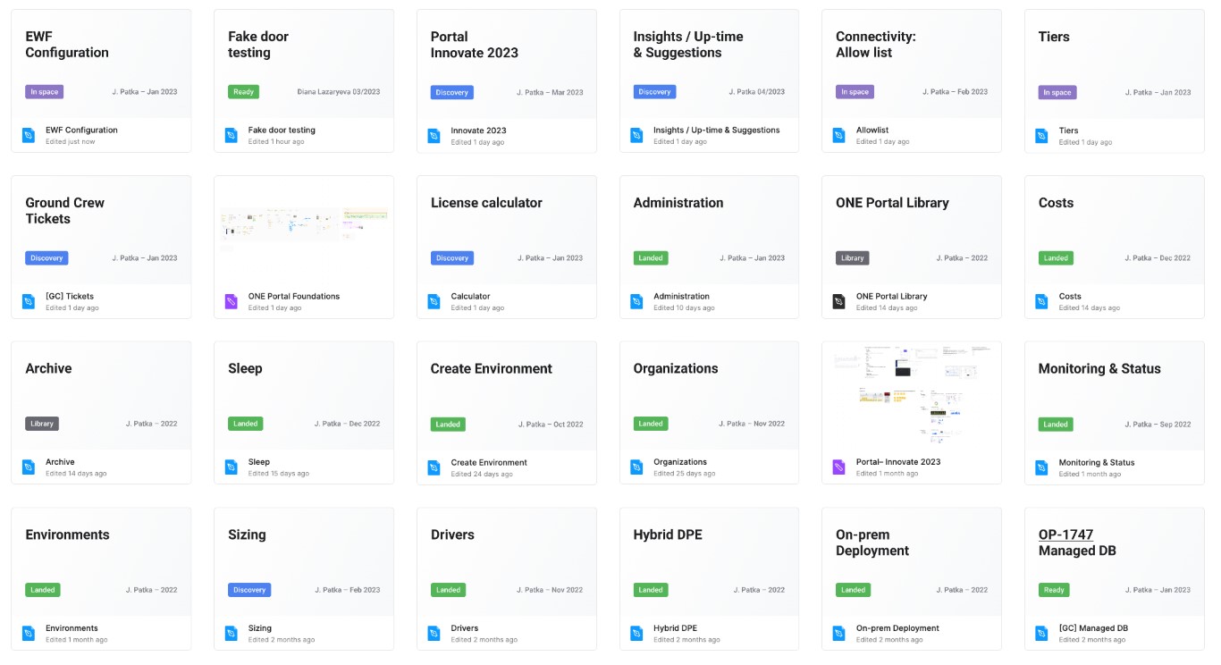
New covers
The new covers have addressed most of the issues identified during research and the workshop. The goal was to simplify the covers to make them easier to scan.
Here's what we changed:
- The covers are now divided according to our SpaceUp methodology (Missions, Ground Crew).
- The status has been simplified from four visible states to just one.
- The states are now using the same convention as SpaceUp.
- The author's name has been added to indicate who is responsible for it.
- The date the file was created has been added.
- The description and links have been removed from the cover for better scannability. Links are now used inside the file with section annotations or in the heading right away.
 Less mess, easier to scan
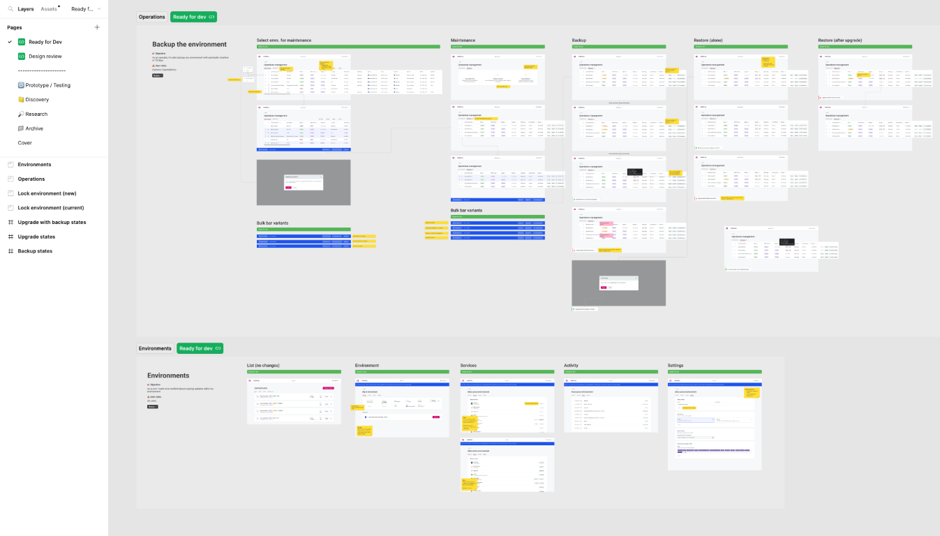
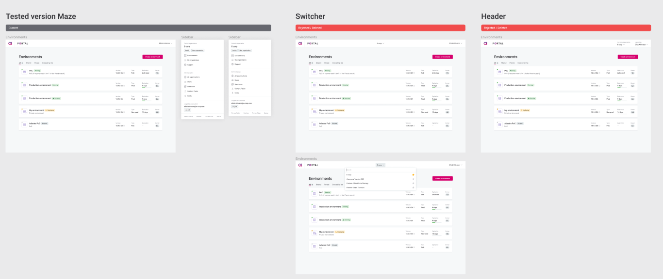
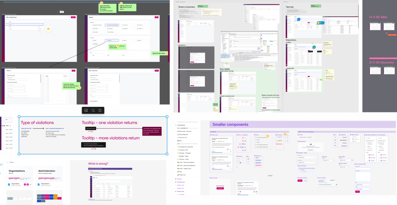
3. File structure
Although we had a template file with defined pages, we did not use it properly due to a lack of consensus on how to use it in various scenarios.
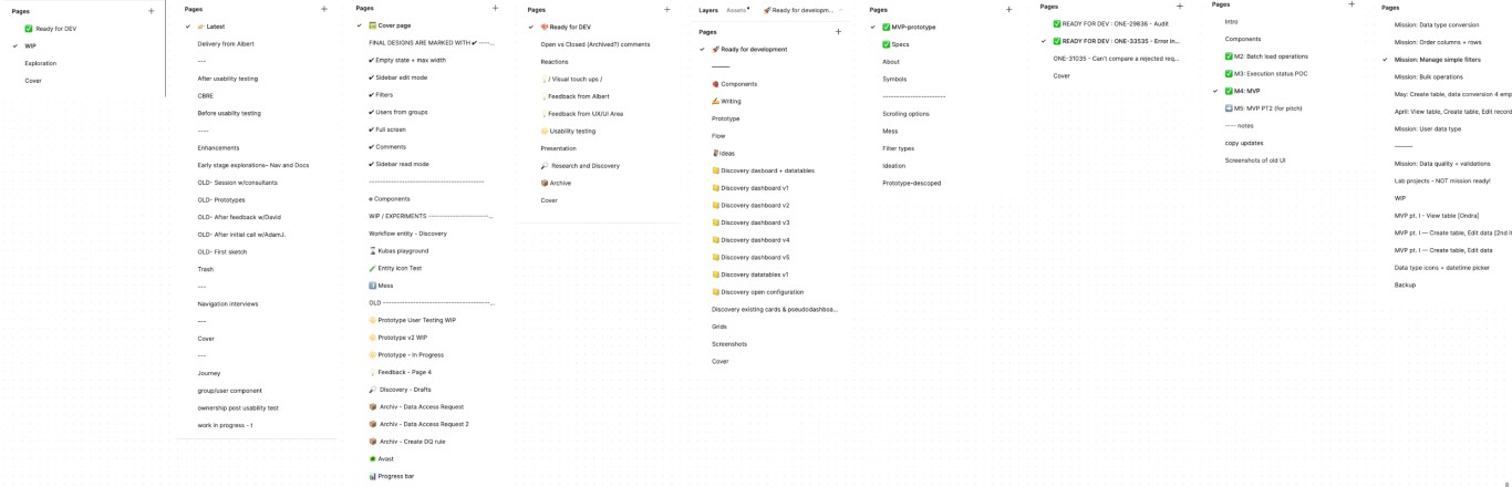
Old structure - real examples
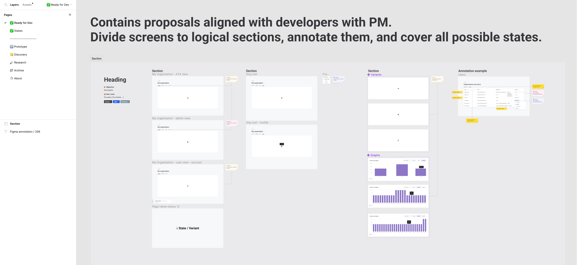
We maintained the original page structure, but we focused on how to approach different use cases. Icons play a crucial role, and are mandatory. A file can contain multiple Discovery or Ready for Dev pages, as long as they use the same icon. Project managers can easily find works in progress, developers know where to find final designs, and researchers can focus on prototype pages only.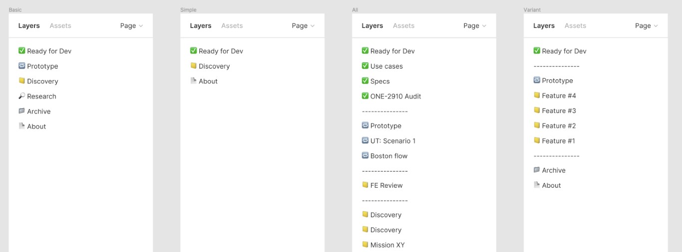
New structure variants
New Page Structure Proposal
- ✅ Ready for Dev
This section contains proposals aligned with developers and PMs. Divide screens into logical sections, annotate them, and cover all possible states. - 🔁 Prototype
The prototype section serves mostly for user testing or for important flow presentations. UX researchers and PMs use it to check tested flows in the future. This page is optional. - 📒 Discovery
This is your playground. Clearly annotate your screens and their status. - 🔎 Research
Use the research page for brainstorming, initial sketches, and competitor analysis. This page is optional. - 📁 Archive
This section includes items that are no longer needed in Discovery/Prototype/Ready for Dev. Keep your files clean. This page is optional. - 📄 About
Cover and link to missions.
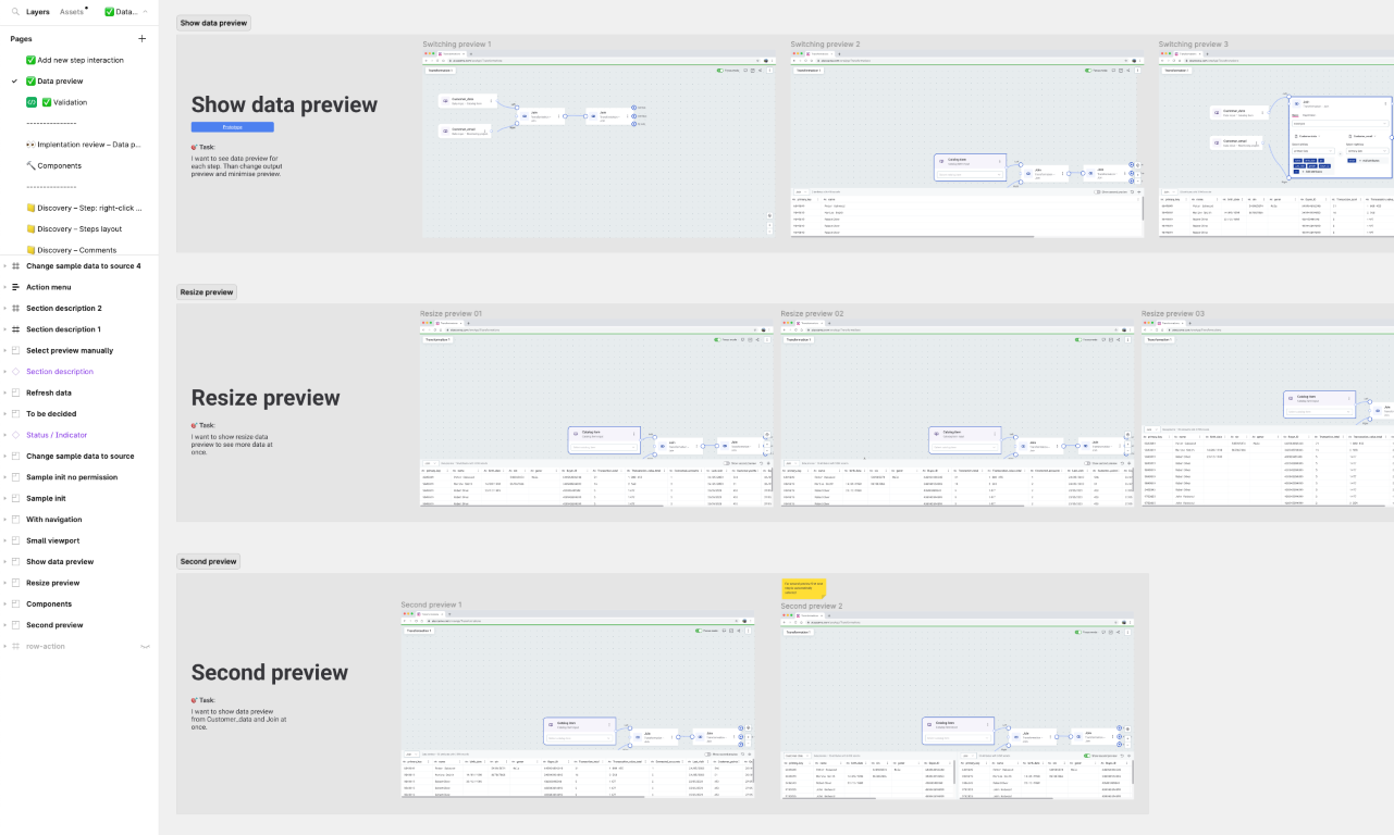
5. Recommended page structure
We were trying to find a way to organize our screens on a page when Figma released Sections, which helped a lot. Our developers just loved it.
The recommendations are:
- Use sections to divide the content into logical parts, such as onboarding, dashboard, emails, and use cases.
- Use section descriptions to explain the objectives, target audience, and provide links.
- Use status indicators to provide clear states for others, such as current vs. new, in progress, in review, ready, etc.
- Use connectors to visualize the flow between sections.
- Use labels to explain your rationale for design decisions.
- Put screens next to each other to show the flow between them.
- Put screens under each other to show variants.
- In case of multiple variants, separate the components and annotate them.
Example structure
Feedback from our developers:
👨💻: "It helped me scan faster."
👨💻: "The page structure was improved by grouping screens for a certain theme together."
👨💻: "I really appreciate the way designs are divided into sections. It helps me find my way around very quickly."
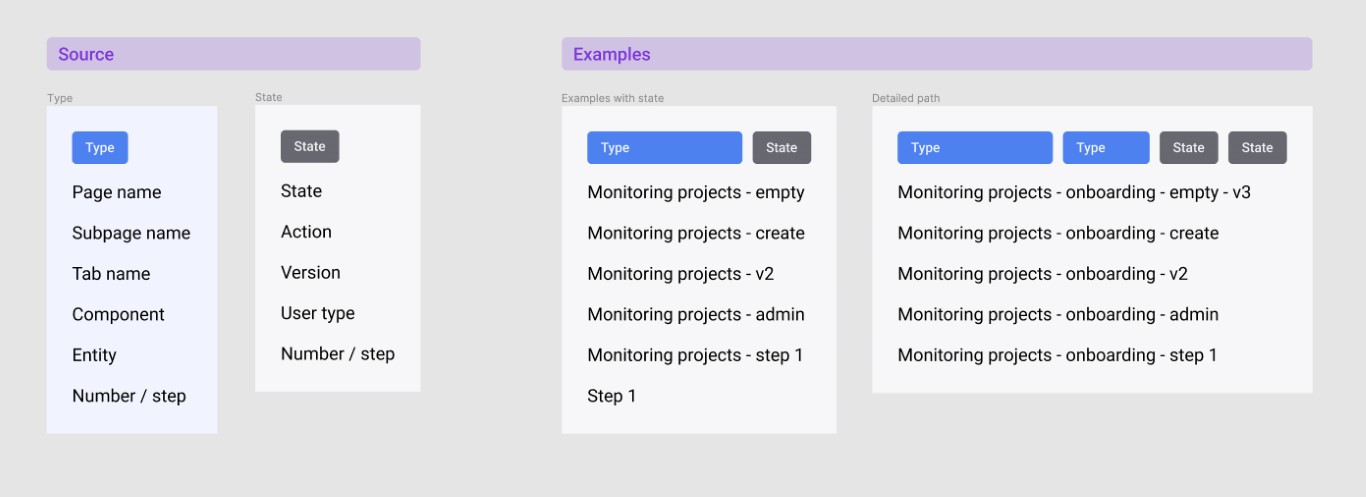
6. Naming Convention
Although it may seem like a small detail, naming conventions are important for helping new colleagues adapt quickly. The main rule is simple: name your artboard by its type and distinguish different states, if necessary. You can use a hyphen to combine different elements.
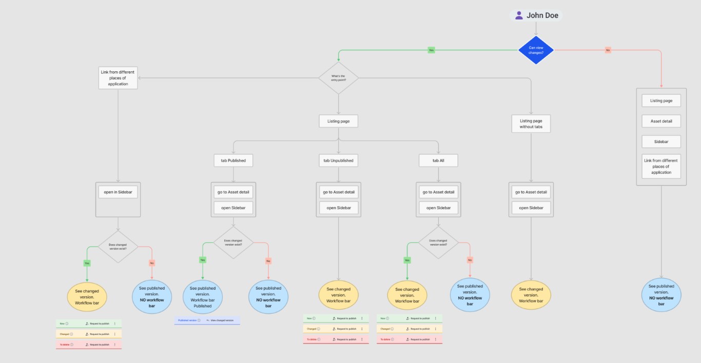
7. Flows / Diagrams
For complex problems, a visual explanation is always better. Initially, we didn't use it much. Then, we made a commitment to use it more often, without any restrictions. After that, we agreed on an approach that was simple enough for everyone to use without delving too deep into UML rules. In the end, it made conversations with PMs and developers much faster. So far, we’re using components from FigJam with no other rules and styles required.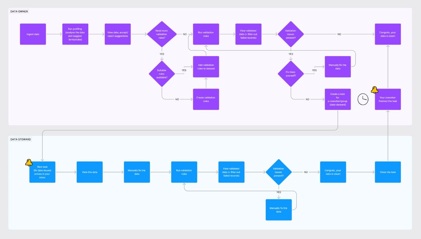
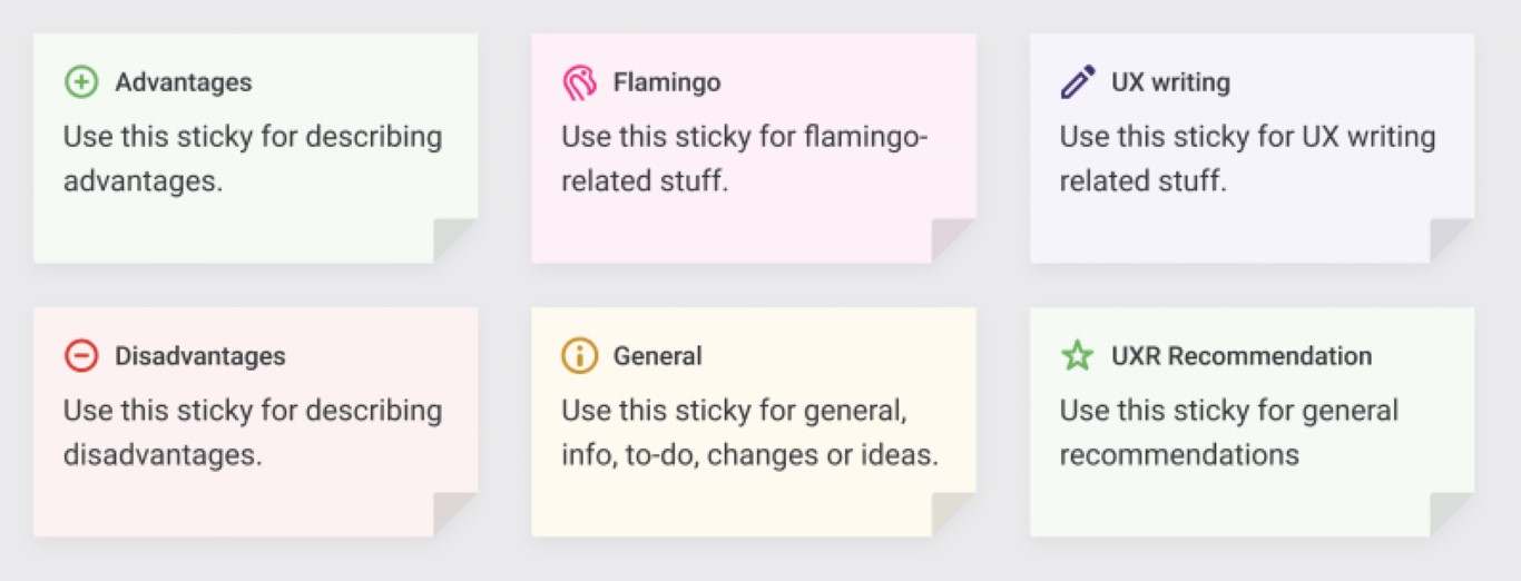
8. Annotations
As you can see from the image below, every designer used annotations a bit differently (if they used them at all). There were no sets of rules, styles, or components for how to communicate with developers in our files. Our goal is to make it easy for every designer and developer across all spaceports to orient themselves and communicate effectively in the files.
Old annotations
Labels and stickers
The combination that worked best for our developers was a sticky note with a pointer. This way, our developers can easily connect the comment with a specific part of the UI. The labels have several variants with an optional heading and a name placeholder.
👨💻: “I prefer a version where the annotation points to the UI element.”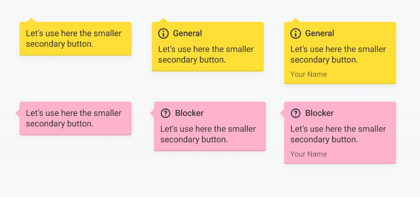
Labels
 Labels example
 Stickers
Connectors
We're currently using FigJam connectors in the hope that Figma will support them natively one day 🙂. These connectors are great for explaining flows to product managers, developers, and other designers. They work better than other plugins we've tried.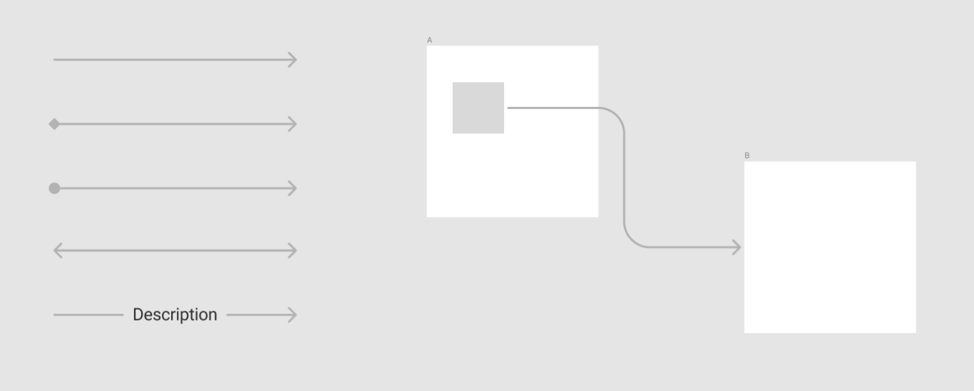
Connector variants
 Flow example
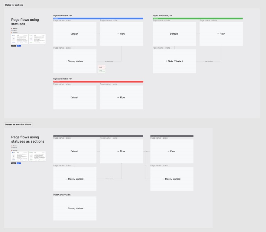
Status indicator
One of the biggest challenges was distinguishing between the current version and the new version, or between the discovery and the final proposal. Although we have separate pages for Discovery and Ready, our goal is to annotate all screens, if possible. The biggest advantage of marking the states is during the Discovery phase. Status indicators are also reused for Covers.
👨💻: “I'm now focusing on the green one (Ready for dev)”
👨💻: “I like that I can see what’s the current (old/deprecated) vs the new/in progress”
👨💻: “The stripes above components are a huge help”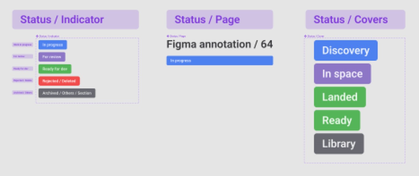 Status variants
 Example
Section description
The mission's brief is typically provided in Notion, but we have agreed that a simplified version in Figma would be helpful.
A section description is used within Figma sections and introduces the entire logical part, such as the user flow. It works well for designers during design reviews and helps during user testing to explain the scenarios. Additionally, it informs other stakeholders about the background and pushes us to use personas. The section description also helps with linking to other tools and vice-versa.
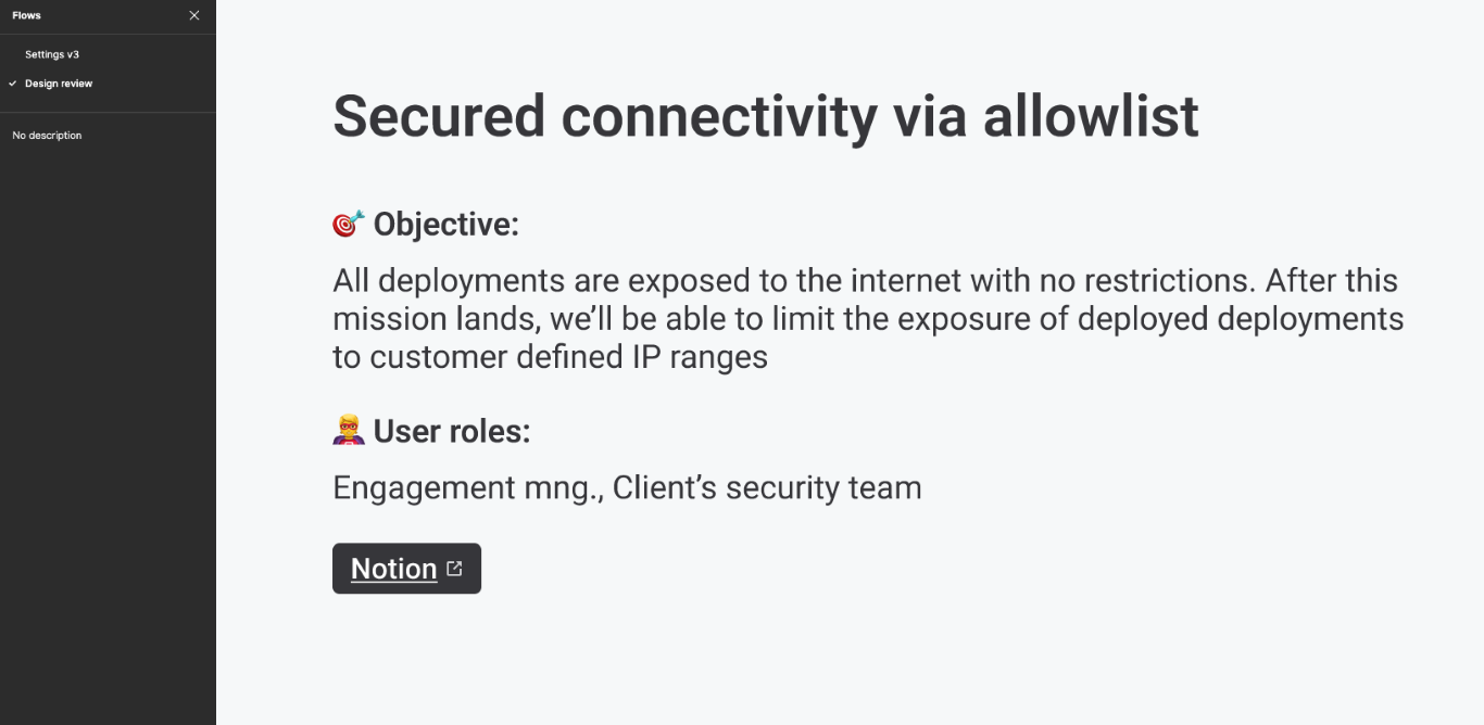 Section description used for a line review
Cursors
All possible states of cursors are based on an external library.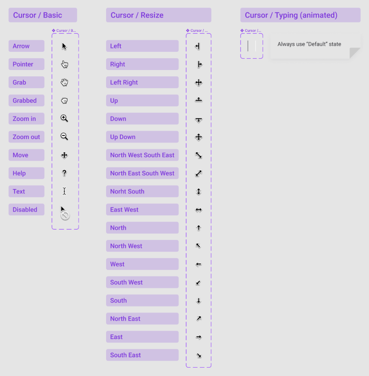
Spacing marker
Sometimes during a UX/UI review, it’s just needed 😎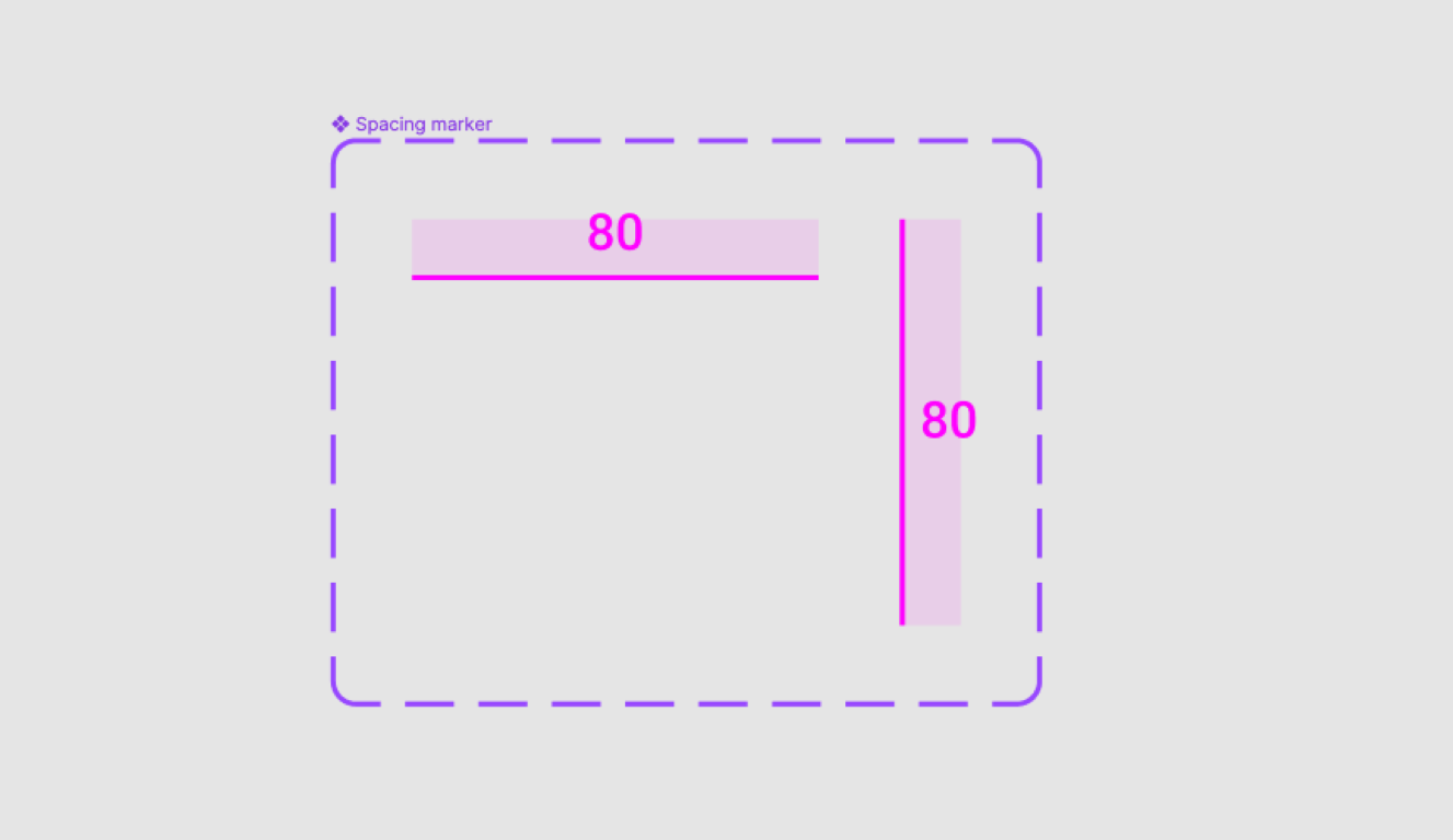
Text styles
Every designer was using a different style, size, and color for their text annotations. Some wanted to have annotations in more written form, some wanted to use more attractive font styles, etc. In the end we decided to keep it simple, use the same font used everywhere and the only variable was the color.
Personas
Our personas have reached the age where they are allowed to get an ID. That's why we recently introduced UX Persona Passports, which contain condensed key characteristics of each persona along with a link to the original full one-pagers.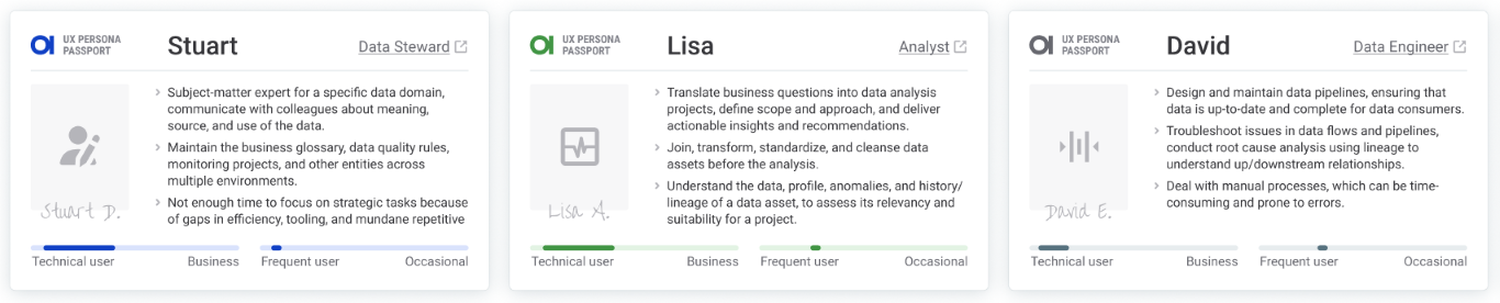
Sharing our outputs
Figma guidelines for non-designers
Firstly, it was clear that we needed to share essential information on how to work with Figma for non-designers such as developers, managers, and executives. We created a guideline in Notion that will be shared during onboarding of new members telling them:
- How to request access to Figma Team
- How to use the standalone app and the browser
- How to navigate the team structure and all spaceports
- How to find the right file
- How to give comments
- How to share the file or a specific frame
- The difference between specific pages within a file
- How to inspect the file.
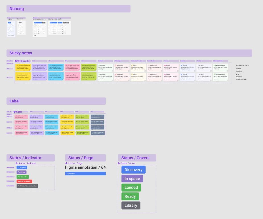
Annotation library
The annotations library is part of our Flamingo design system library. It consists of all components described in the Solution section.
Example file
Examples of use, ready for our new colleagues.
Template file
An empty file ready to use for our projects.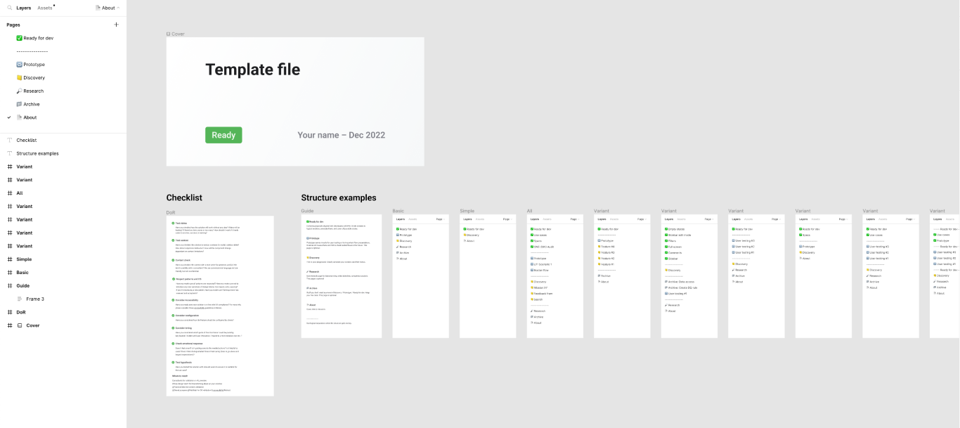
Results & Conclusion
We assumed that it was impossible to launch everything at once and say "now, you use it." Instead, we chose to gradually launch small improvements and regularly collect feedback from the team. For example, our covers had several iterations until we agreed that they were really good. Now, a few months later, there are new discoveries that might improve our covers even further.
Do we use it correctly?
We had to change the way our creatives work, which is always tricky. Each designer has a slightly different background and process.
First of all we tended to show our work-in-progress during design reviews with an already updated structure, layouts, and annotations as much as we could. We believe the best way is to inspire others. After some time, we had to say “from now on, please follow the guidelines”. Unfortunately, that was apparently not enough.
When we checked our files after a few weeks, we saw a huge improvement but it was still far from perfect. In some files, it was still hard to find your way. Annotations were missing in Ready for Dev pages. And there were also a lot of variables in components we agreed on. What went wrong? We got in touch with our colleagues, asking exactly the same questions we identified during our research — what is the latest version, what is the difference between these flows, or why do you use different annotations, etc... The overall feedback was that they either didn’t have time to start using it yet, they had to adjust new components to fit their needs, and some didn't even know where to find the annotation library, even though it was mentioned several times.
My takeaways are:
- Make sure the guidelines and your annotation library are easy to find.
- Reinforce the topic at every opportunity you have.
- Don't be afraid to speak up and discuss the topic openly.
- Collect feedback and iterate.
- Be the perfect example and inspire others.
- Deep-dive your proposals with newcomers.
- One way to change someone else’s habits is to let them go through the experience on their own.
Have we succeeded?
We've made significant progress since our initiative began. Prior to this, we had no guidelines, inconsistent processes, and a mix of different components. Today, we have guidelines, enhanced and unified components, and aligned processes. We believe that every new designer or developer will have an easier time finding out what to do.
However, there is still room for improvement. In an ideal world, every designer would use the same components with no anomalies. But the diversity of obstacles each designer faces contributes to new ideas and variations, leading to continuous improvement in our design handoff.
The feedback we've received from our colleagues has been the most important aspect of our progress. Although we haven't conducted a final evaluation across the entire company, we’re confident that there has been an improvement just from reading what our colleagues have written.
- "It’s better, time will tell” BE engineer
- “It’s definitely better and still improving” PM manager
- “The fact that screens for a certain theme are grouped together is a great improvement” PM manager
- “I really appreciate the way the designs are divided by pages. It really helps me to find my way around very quickly. Also I love the states of the components” FE lead
- “When I go to another file I know where to look” Designer
- “FE guys are happy with more description used thanks to annotations” Designer
- “It’s easier to navigate in different files thanks to sections” Designer
- “Covers are helpful for navigation” Designer
- “Files had similar structure even when I switched to another spaceport” FE developer
- “I usually look at what's green. It's also useful to see the current vs the new state” FE developer
The next step is to conduct a second round of internal research to compare “before” and “after” results. As mentioned before, the process never ends, and we will continue to review and improve our design handoff continuously.